Welcome to the third part of our crypto trading guide series for beginners! In this article, we’ll dive into a critical price action concept: confirmation versus deviation. Understanding how to distinguish between these two patterns at key levels can help you avoid fakeouts, take high-probability trades, and stay disciplined in the volatile crypto market. We’ll break down what confirmation and deviation look like, how to identify them using simple price action rules, and why patience is key to mastering this skill.
Understanding Confirmation vs. Deviation
Confirmation and deviation are price action patterns that help you determine whether a breakout or breakdown at a key level is likely to continue or reverse.
A confirmation signals a high-probability trade setup, where price respects the key level and moves in the expected direction, while a deviation indicates a fakeout, where price briefly breaks a level but reverses, trapping impatient traders.
For beginners, learning to spot these patterns can prevent costly mistakes and build confidence in your trading decisions. We’ll focus on identifying confirmations and deviations for both long and short setups.
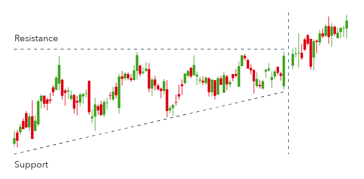
Identifying a Confirmation for Long Trades
A confirmation for a long trade occurs in 5 steps and they have to be in order:
- Price breaks above a key level (a significant resistance)
- Price retests the key level
- Price forms a new high
- Price retests the former high as support
- Entry at former high and place stop loss below key level, targeting the next key level
This sequence confirms the breakout’s validity, signaling a strong entry point.

Example: SOL Long Confirmation (April to May 2025)
Take for example Solana’s price action during the period of late February to May 2025 (figure 2). $135 was a significant key level for 4 weeks acting as support, until price completely broke below the key level in early March which then acted as resistance. The sequence of the long confirmation setup is as follows:
- Price broke above $135 resistance in mid April reaching $141.96
- Price retested the $135 key level
- Price made a new high at $152.3, confirming the $135 key level as support
- Price retested the former high at $141.96
- Enter at $141.96, place stop loss below the $135 support level and target the next key level at $176.48

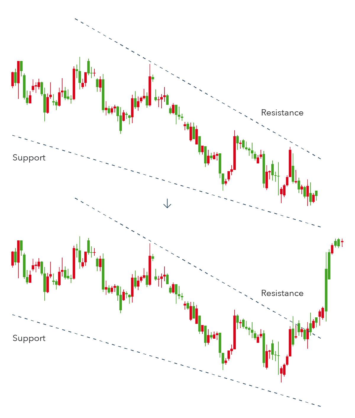
Identifying a Confirmation for Short Trades
A confirmation for a short trade occurs in 5 steps and they have to be in order:
- Price breaks below a key level (a significant support)
- Price retests the key level
- Price forms a new low
- Price retests the former low as resistance
- Entry at former low and place stop loss above key level, targeting the next key level
This sequence confirms loss of momentum from buyers, signaling a strong entry point.

Example: BTC Short Confirmation (Feb to April 2025)
Take for example Bitcoin’s price action during the period of February to April 2025 (figure 4). $90,500 was a significant key level for BTC acting as support since December 2024. Price made a new low once the daily candle closed below the key level on February 25. Price continues to make new lows, so there are multiple points to take into account. In this type of situation, marking out the candle body closes is very helpful. The sequence of the short confirmation setup is as follows:
- Price breaks below the $90,500 support and closed at $88680.4 on Feb 25. Price continues lower the next day and closed at $84,250.09
- Price retests the $90,500 key level and closed above on March 2 but completely reversed the next day
- Price forms a new low at $78,595.86, confirming the $90,500 key level as resistance
- Price retests former low 2 and former low 1
- DCA entry from former low 2 to former low 1 (shown in the green box) and place stop loss above the $90,500 key level, targeting the new low or previous key levels below

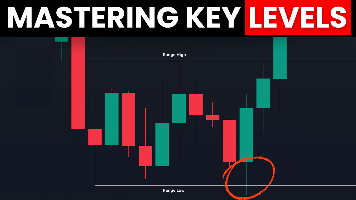
Spotting a Deviation and Avoiding Fakeouts
A deviation occurs when price breaks a key level but fails to confirm with a retest, new high/low, and subsequent retest, often forming a semicircle pattern that signals indecision. This leads to a reversal, trapping traders who enter too early. Deviations are generally risky because price can move very quickly in either direction. However, deviations can still be traded if price distributes slowly.
Identifying a Deviation for Long Trades
A valid deviation for a long trade occurs in 6 steps and they have to be in order:
- Price breaks below a key level (a significant support)
- Price reverses and close above the key level
- Price retests the key level
- Price forms a new high
- Price retests the former high as support
- Entry at former high and place stop loss below key level, targeting the next key level
Notice how it is basically a confirmation sequence/pattern but with an extra step – the deviation!

Example: $S Long Confirmation off of Deviation(Jan to Feb 2025)
Take for example Sonic’s price action during the period of January to February 2025 (figure 5). $0.5008 was a significant key level for $S acting as both support and resistance in January. As you can see, there were multiple deviations that occurred where price action was indecisive, hence why deviations are risky. Selecting the right one to trade requires waiting for confirmation. The sequence of the long confirmation setup off of the deviation is as follows:
- Price breaks below the $0.5008 key level
- Price reverses and closed above the key level at $0.5685
- Price retested the key level
- Price made a new high at $0.6197
- Price retested the former high
- Enter at former high, place stop loss below the $0.5008 support level and target the next key level at $0.7809

Identifying a Deviation for Short Trades
A valid deviation for a short trade occurs in 6 steps and they have to be in order:
- Price breaks above a key level (a significant resistance)
- Price reverses and close below the key level
- Price retests the key level
- Price forms a new low
- Price retests the former low as resistance
- Enter at former low and place stop loss above key level, targeting the next key level
Based on my experience, this is especially prevalent for altcoins where buyers get trapped on the break above the resistance, thinking it is a confirmation for a breakout.

Example: SUI Short Confirmation off of Deviation(April to June 2025)
Take for example Sui’s price action during the period of April to June 2025 (figure 8). $3.6936 was a significant key level for SUI acting as resistance in late April and support in mid May. Price made a new low once the daily candle body closed below the key level on May 23, confirming the entire price action above the key level as deviation. The sequence of the short confirmation setup off of the deviation is as follows:
- Price breaks above the $3.6936 key level
- Price reverses and closed below the key level at $3.5360
- Price retested the key level
- Price made a new low at $3.1701
- Price retested the former low
- Enter at former low, place stop loss above the $3.6936 support level and target the next key level at $2.7825

Key Takeaway
The most important principle is to wait for the full setup—breakout, retest of the key level, new high/low, retest of the former high/low—before taking a trade, ensuring you’re entering high-probability setups while avoiding fakeouts. This analysis avoids assumptions or bias, focusing on the observable behavior of buyers and sellers through candlesticks and the economic principles of supply and demand at key levels.
Notice in the images they all form a higher high, higher low structure for longs and lower high, lower low structure for shorts. Yes! This is how you correctly enter at pullbacks in combination with key levels. You are essentially buying high, selling higher for longs and selling low, selling lower for shorts.